REBRAND
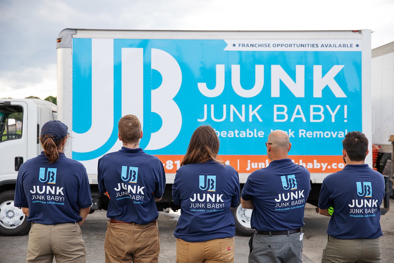
Junk Junk Baby! rebranded their junk removal company, keeping their primary goal of franchising in mind while making design decisions. By creating a bold wordmark and setting guidelines, the brand became solidified. Every day they approach their customers with a level of compassion and professionalism to junk removal makes them unbeatable. The 2022 rebrand won an Indigo Award - Bronze in Services.
TRUCK WRAP
With their new branding came a repolished truck wrap. To keep their logo partially intact, I extended the color blocks and incorporated the contact info into the orange line. The bright blue as the primary color in the design was chosen to make the truck stand out while driving down the highway.
LOGO DESIGN
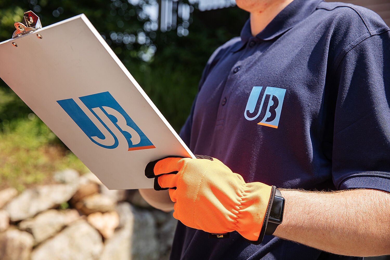
The client requested a bold monogram with a refreshed color palette. So I brightened the blue and added the complementary orange to make the design pop. In order to make the two J's not as jarring, I made the second ascender part of the B and hugged the arc of the stem to the main J. The monogram also doubles as a subtle cutout when layered upon other colors.
MAGNET
After the truck design being a hit the client wanted magnet versions of the truck. Using Adobe Illustrator I made a cartoon version for Junk Junk Baby! to hand out to their satisfied customers.
STYLE GUIDE
This style guide helps their team as they continue to grow their brand. The Kanit font family is used throughout their brand and logo. To keep designs clean and printing costs affordable, we kept their color palette at three colors, bright blue, orange, and calm gray.
TRUCK MAGNET
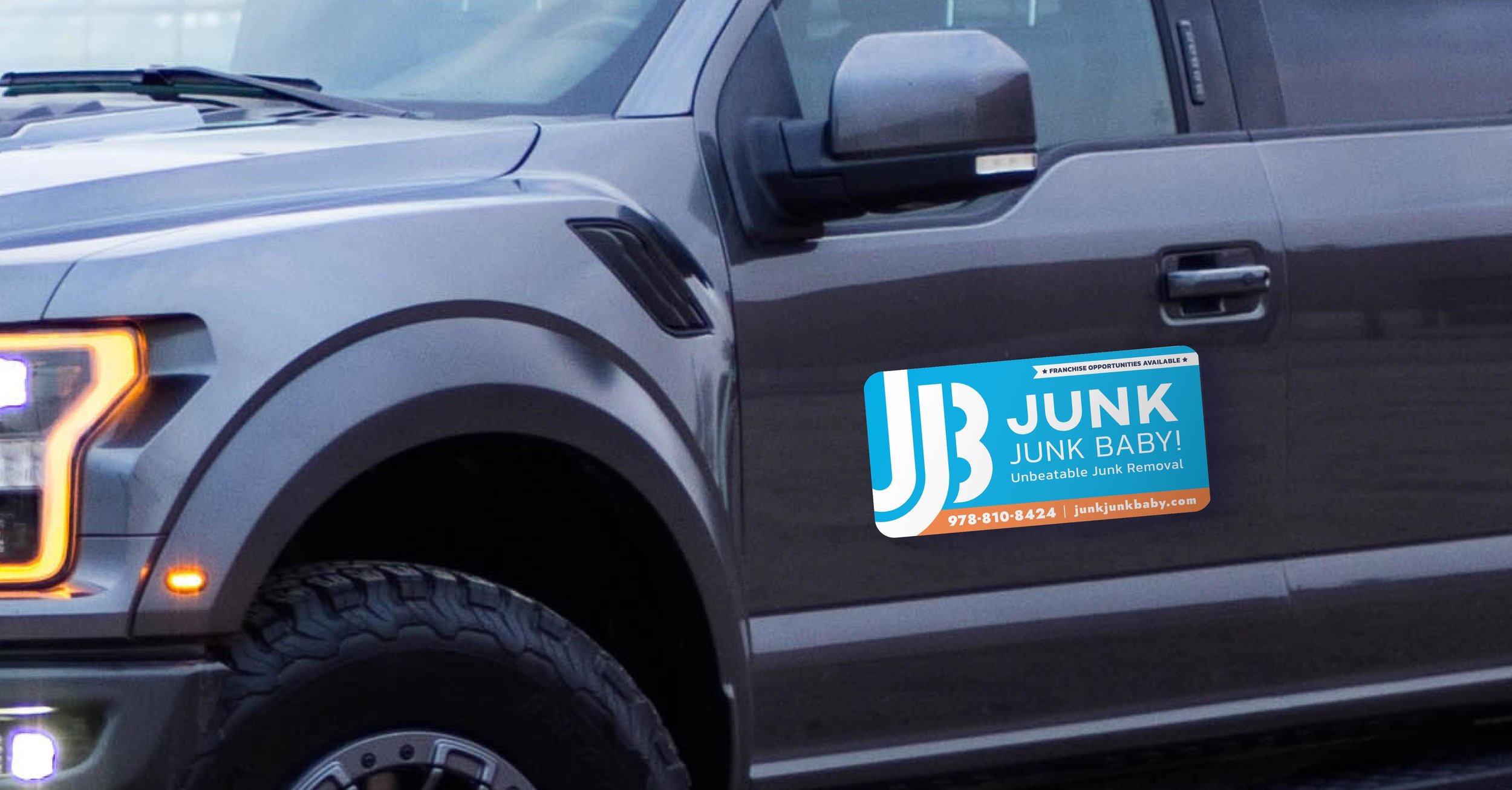
Along with their large truck JJB! has multiple smaller trucks to service their clientele. The main truck design was adjusted to be compatible with car magnets to make all vehicles associated with the company.


